


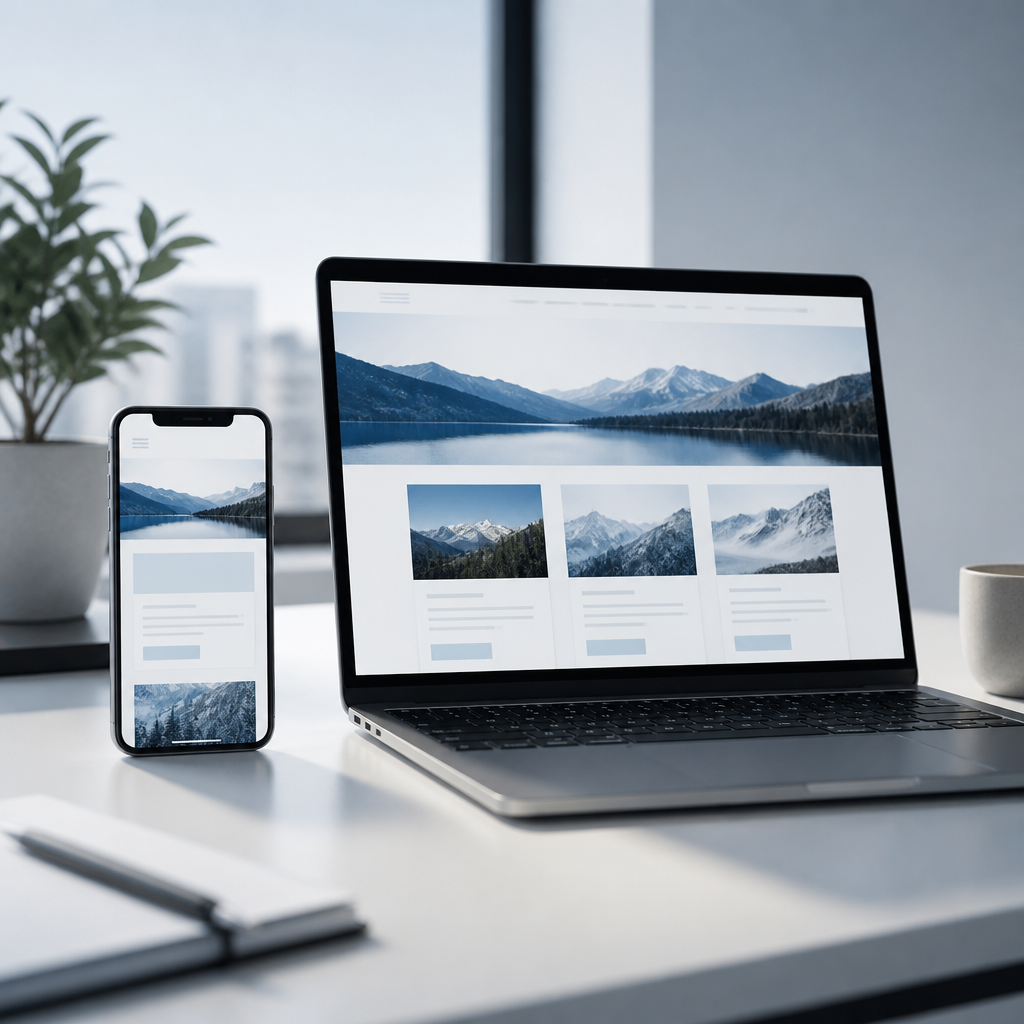
The development of technology led to the launch of a variety of smart and sophisticated devices including smart phones, I-Pad devices and tablets, these devices are evident as devices with wide support for the Internet and allow surfing from anywhere and at any time with great convenience for the user which led to an increase in the percentage of customers who currently own this type of device, business owners and companies realized that the percentage of surfers on their website using mobile devices has increased significantly and therefore they could not ignore the fact that the website must be adapted For mobile and the various operating systems (IOS, Android, etc.).
Ensuring simplicity when building websites for mobile
Browsing on the mobile device is considered optimal when the surfer finds his way around the site within a few seconds due to it being a mobile device and small in size, as soon as the surfer is unable to find his way around the site easily and conveniently the business suffers from losing potential customers.
The search trend using a cell phone is on the rise due to the convenience, portability and the fact that we cannot disconnect from the device that is constantly connected to the Internet.
Adapting the device to mobile is intended to make it easier for the surfer to navigate the site due to different screen resolutions which make the user's experience more difficult when surfing.
Full potential utilization
The Internet has become a central tool in our lives and thanks to the extensive infrastructures scattered throughout Israel and the world we can now surf from anywhere and at any time. When a business decides on building a website as an optimal marketing tool, it should not rely solely on its adaptation to the different resolutions on the computer and in the different browsers, 40% of all internet surfers today do so using mobile devices, therefore a business that wants to take advantage of the full potential that the internet has to offer and gain a lot of exposure and a potential target audience is aware that its website must be adapted to the various mobile devices.
Today, it is a mandatory requirement for every business and company that is interested in exposure and optimal marketing when contacting a website building company, to provide an uncompromising user experience for the mobile surfer who is a significant percentage of all traffic on the website.
The Digital.S.T company specializes in building professional websites for businesses and companies while personalizing them for all mobile devices and providing a comfortable and friendly user experience, thus being among the only companies that provide a professional and technological service for its customers.
There are several types of adaptations for a mobile device, these adaptations involve a higher price offer and are therefore not suitable for everyone:
- One option is at the same time as the website in its full version as shown in the computer screen resolution, a responsive website adapted to the mobile device will be displayed, when entering the website via the phone two options will be displayed for the surfer to choose one will be the presentation of a website adapted for mobile and the other will be the presentation of a website in a normal version, this option is intended to include all the information and content that appears in the normal version (when building a website adapted to mobile it is necessary separate content and files so that the display is optimal for the surfer).

An example of this is the Beit Maimon hotel website which offers an option to choose between two versions.
- A second option is to present a responsive website and adapted to the phone, as soon as the surfer enters the website, the menus will be large and the display will be adjusted so that it does not require the surfer to enlarge or reduce the screen accordingly, this option includes more content than what the first option offers for the client and therefore its development will be more expensive.
.png "Building a mobile-friendly catalog website")
An example of a catalog site that offers, when entering through a mobile device, full adjustment of all details and a convenient and ideal user experience.
maintaining an optimal user experience
One of the most important factors when building a professional website for mobile is maintaining the user experience that the surfer is accustomed to on the official website of the business, performing the same operations with the comfort and simplicity he expects to find when browsing the website using the mobile device, friendly navigation between the menus on the website and answering the surfer's query with the greatest comfort.
Likewise, smart phones are known for options to change screen resolutions to vertical and horizontal resolutions, building websites in accordance with mobile devices allows full adjustment when turning the device into a responsive display adjusted according to the type of resolution.
How does it work?
- First of all, as mentioned earlier, it is very important to take into account how the user's experience will be when browsing a website through a mobile device.
- The adjustment of the website is required to be on all devices, just as on a computer an adjustment is made to browsers, so on a mobile device according to the type of device and the list is very long.
- One of the ways to adjust the display of the website for the mobile device is by changing the code or rewriting the code, CSS3 allows this operation but not all devices support CSS3, although this can be solved by identifying the device on the server side using HTML or JavaScript code.